Graphics and Illustrations
Sometimes, the best way to support the message is to use charts, graphs, scientific graphics, illustrations, or digital renderings. Follow these standards when providing graphics and illustrations for NREL.gov.
Accessibility
To make your graphics accessible to all users, follow these guidelines.
Alternative Text
Provide alternative text that represents the content and function of graphics. NREL web content specialists are available to write and answer questions about alt text.
Color Reliance
Do not use color as the only way to convey information. To ensure graphics do not lose meaning when colors are removed, view the image in black and white to see if it’s understandable.
Consider using other methods—such as texture or symbols—to convey the content. NREL designers can help you modify graphics to convey information without relying on color.
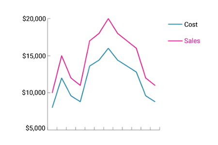
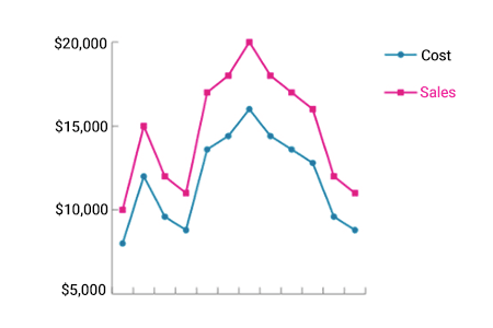
Example: Shapes were added to the lines to differentiate the lines without color.
Color Contrast
Elements that convey meaning, including components in charts and graphs, must have a contrast ratio of at least 3:1. Use the WebAim Contrast Checker to check colors. NREL designers are available to help with color selections.


Example: The original image had low contrast between the background and text. Both were changed to increase contrast.
Text in Images
Important content should be coded as HTML text, which is directly accessible to screen readers.

Example: The text in this graphic is important content and should be coded.
Responsive Design
The 21st Century Integrated Digital Experience Act (IDEA) requires that all government websites and applications be mobile-friendly.
Text and other components that convey information should be large enough to read on a small screen.
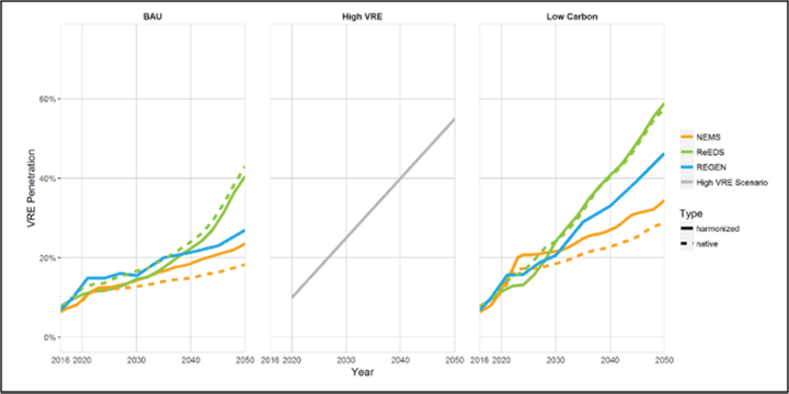
Example: The text in this graphic is not legible on mobile. It was fixed by breaking the charts into three images that stack on mobile.

Example: Consider context. In this example, the text is small on mobile, but the image was used to demonstrate a concept, not convey actual data. The client wanted to demonstrate the ability to display data in this format. The actual data wasn't important.
Use HTML text instead of embedding text in images to allow the text to rewrap for smaller screens without making it smaller.
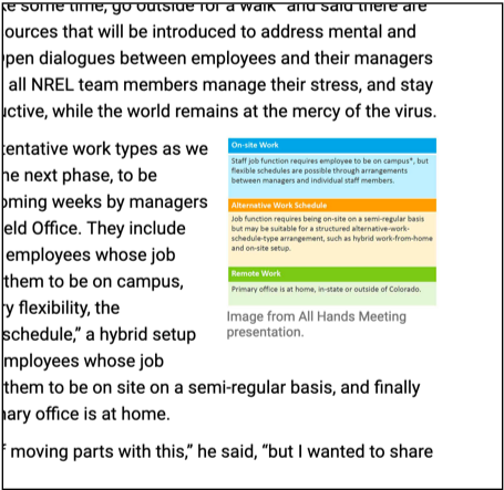
Example: The floated image of text on this page is hard to read at small sizes.
Interactive Graphics
Consider interactive graphics to help tell your story. Work with your designer and developer to ensure they are responsive and accessible to all.

Search Engine Optimization
Page load time is a primary ranking factor for search engines. Images should be optimized to allow web pages to load quickly on low-bandwidth connections. Typically, web images should be no larger than 100 KB, and the entire page should not contain more than 1.5 MB of graphics.
Avoid embedding text in images. Important content should be coded as HTML, which is searchable and helps pages rank higher in search results. See the example above.
Branding
Use colors from the NREL color palette, and check with an NREL designer to ensure your graphics align with NREL branding.
Usability
Include titles for charts to help users scan the page and understand, at a glance, what your chart is about.
To improve usability, also consider the amount of information presented in a single graphic. Simplify charts, graphs, technical illustrations, and renderings so they are not difficult to read on small screens or too complex for the highest levels of the website.
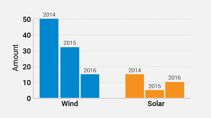
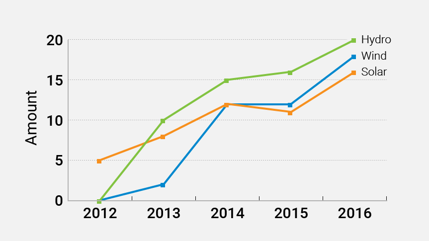
Example: These charts are legible on small screens and are not overly complex.
Page load time is essential for web usability. Keep file sizes small and limit the number of graphics on the page to help the page load quickly.
Quality
When considering images for feature spaces such as the NREL.gov homepage or research site homepages, only use high-quality photos that follow our photography criteria.
Share
Last Updated Feb. 21, 2025
